
How To Find Your Personal Contrast Level And Why It Matters
A reader wrote in with a question. I get more than you’d think. She’d gone gray and noticed that some colors in her seasonal palette were suddenly working better than others. She wanted to know if there was a formula she could use to sort it all out.
There is, and it starts with contrast.
Most people focus on finding the right colors for their complexion, which makes sense. But your personal contrast level is just as important, and it’s often the missing piece when an outfit feels a little off, but you can’t quite put your finger on why.
Before we get into how to find yours, it helps to understand how color actually works. Every color has three components. Hue is the color itself, think red, yellow, blue. Value is how light or dark that color is. Saturation is the intensity or purity of the color. All three play a role in whether a color combination flatters you or flattens you.
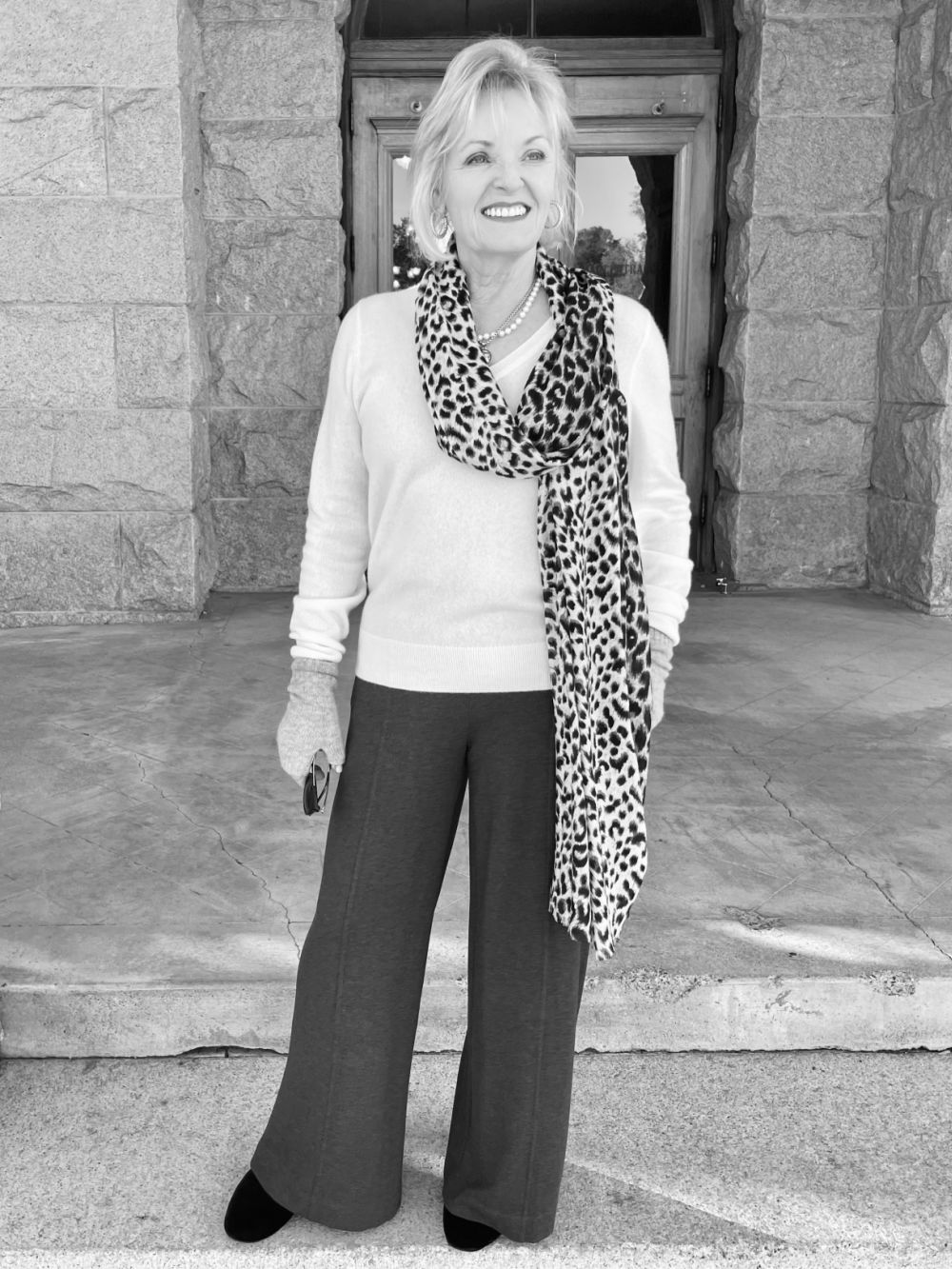
Our hair color, skin, and eyes all have a value (light to dark) on a sliding scale. Our personal contrast level is the difference between them. Wearing contrast levels that match your own contrast levels is as important as whether the undertone is warm or cool. In some instances, it’s more important!
High contrast is when there’s a large difference in the lightness of one or more colors. For example, if you have very dark hair and light blue eyes, you have a high-value contrast. However, if your dark-colored hair has gone a medium grey, it will lower the difference (contrast) with your eyes. As our hair goes gray or silver, our personal contrast level will shift.
If you have light silver or blonde hair, fair skin, and pale eyes, you have a low contrast value and will look best in low-contrast outfits. Medium value contrast is when there’s a difference, but it’s not extreme.
Contrast levels that are too strong overpower and wash you out. Conversely, wearing a contrast that is too low reduces your visibility. Knowing and wearing outfits that echo your personal contrast levels keeps you looking vibrant and visible at a time when society often overlooks midlife women.
How to find your personal contrast level
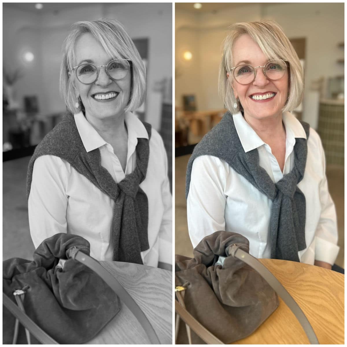
The easiest way to see your inherent color contrast is to take photos of your face and hair. Then, use the settings on your phone to change it to a grayscale, monotone image. Now you’ll see the difference in the intensity of your hair, eyes, and skin. I have makeup on in my photos, but you can still see the difference.

The black and white have a strong contrast that overpowers me. The red lipstick attempts to make it flattering, but falls short in the monochrome image. The black jacket is intense against my complexion. Its contrast with the white shirt draws your eye to the garments rather than to my face.
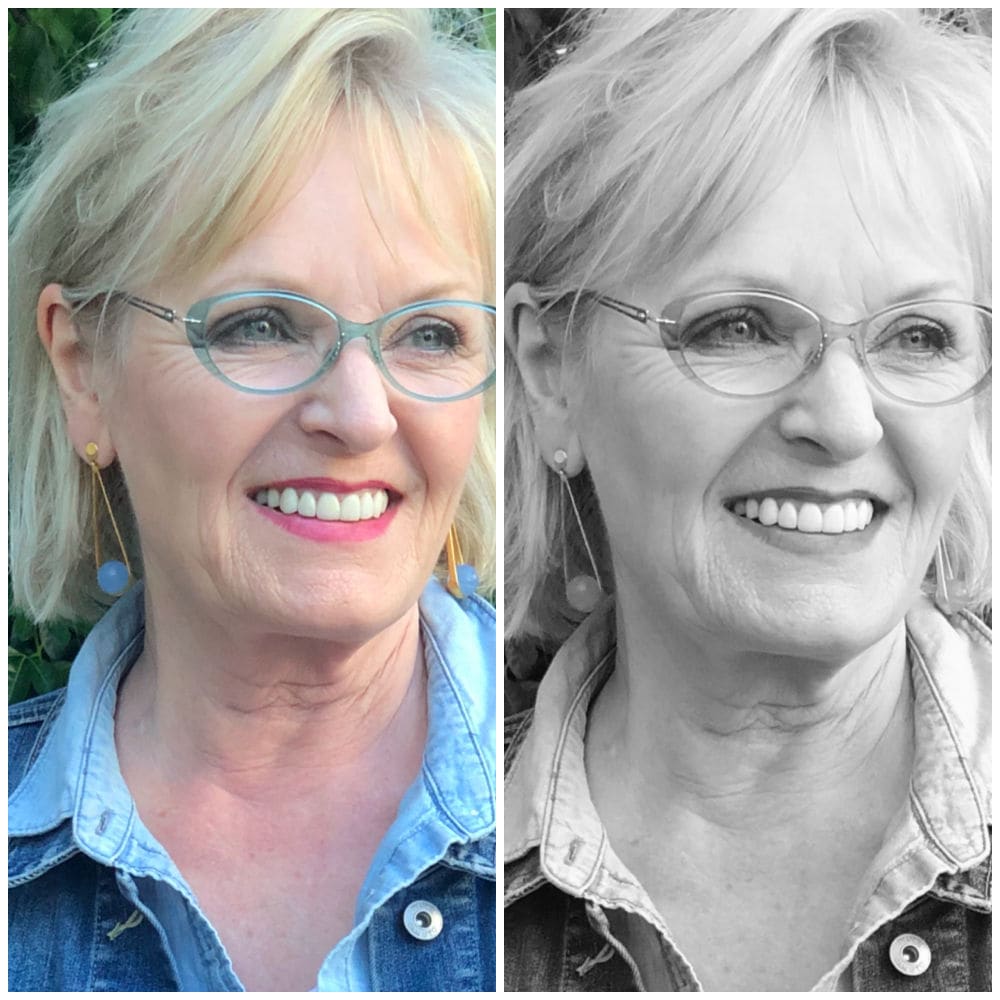
In this photo, I have highlighted pale ash blonde hair. Along with my fair skin and medium eyes, I have low-to-medium contrast values that match the chambray shirt and denim jacket. My eyeglass frames and lipstick are also a low contrast, which doesn’t overpower my coloring. My low intensity is also why I am flattered by monochromatic outfits, as they are the epitome of low contrast.

Since I’ve let my hair go natural (silvery), the contrast between my hair and eyes has become even softer than when I was highlighting it. This black shirt looks even starker against my low contrast coloring, so my head looks like it’s floating.
Below is another example using outfits. The same sweater with different-wash jeans is a great example. High contrast is when there’s a big difference between one or more colors. Low contrast is when they’re very similar. Medium contrast is when there’s a difference between them, but it’s not extreme.
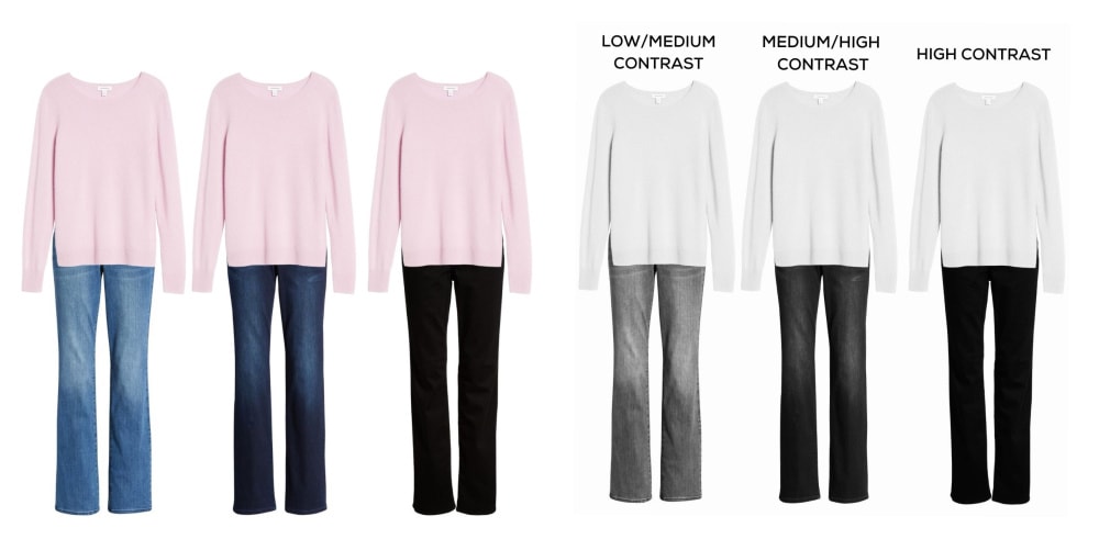
When we remove the color, you can see the contrast levels. The light sweater and deep-wash jeans have a high contrast, which would flatter someone with equally high contrast. If you have white hair and deep brown eyes, you can wear a stronger contrast.
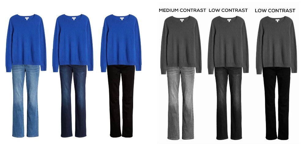
Now let’s try a deeper sweater with the same jeans.
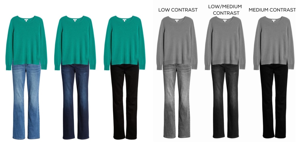
Now here’s a sweater with a medium value and the same jeans.
Try this yourself. Do all the grays meld softly, or do your eyes stand out? Is your hair noticeably darker than your skin tone? The comparison is what shows your personal contrast level. With practice, you’ll learn to recognize the contrast levels in outfits so you can wear ones that match your own. These will be the most flattering, so you’ll look the most vibrant and visible.
Hair that changes from black to pale gray lessens your personal contrast level, so you will look better in color combinations with lower contrast. You may also look better wearing the lighter colors within your palette. Remember, you will not change seasons, just the colors that flatter you most within those seasons…unless you were mistyped in the first place.
Do you pay attention to contrast levels in your outfits?
Thanks for reading, and remember to wear what makes you feel confident.

Great info in this post!
For redheads, the shift in contrast throughout our lives can be quite dramatic. This is where I get caught up. The shift from strawberry blonde hair to coppery to dark auburn back to blonde to white was gradual at points but rapid at others. At 50% grey, it was as if I woke up and none of my clothes looked right anymore. Redheads like me never go completely grey, though. There’s always some blonde. My point is that if you’re a redhead, your contrast levels may need reassessment often throughout your life, and more so on the later part of the journey.
My safest bet is to stick to medium value colors and low contrast. Too much or too little value is tricky. I do wear lower value colors in the summer months but can’t stray from my spring color palette. Very tricky indeed.
This is such a great post and an understandable explanation. I’ve always been a high contrast person, but I’ve noticed lately that I am drifting to lower, at least medium, per choice. Now I understand why! Thanks so much.
Such great information! It’s so meaningful when you can apply a label to a concept! To answer your question, I never realized that I paid attention to contrast levels, but now that you’ve explained it, I see that I’ve been doing that-just didn’t know why! Guess I’m in the high contrast category, but sometimes low with monotones; never a fan of light blue or royal blue with dark blue, for example. Love the color photos vs. black and white ones to really see the difference. Thank you for such a valuable lesson!
I learn so much about color theory reading your posts. I especially like that you remind is to wear what makes us feel confident and comfortable in our clothes. Thank you.
Fabulous post Jennifer. Made me stop and consider how I have been dressing. Thanks a million, you are super!
Linda
Glad you enjoyed it Linda
I have been dealing with contrast subconsciously as my hair goes gray.
Your piece helps so much making the contrast issues real! thank you
That was so enlightening. I’ve also gone silver gray, but have dark eyes. Now I realize why my favorite “royals” have not been as flattering. Thanks for always sharing with us. Sandra
Very interesting and informative ā¤ļøā¤ļø
Contrast is a fairly new concern for me. As my hair goes from dark ash blond with highlights to natural silver highlights, I started to notice changes. I was doing med to high contrast now I am finding the med to low is better. You did a great job explaining it. I highly recommend doing a quick b&w picture when ever a person feels their outfit is off somehow. It really helps. Take colour out of the equation and you can even see proportions better.
I totally agree about it helping with proportions too.
Great information! Contrast levels explain what I have been trying to figure out since my hair went gray. Now I have a plan. Thank you!
Awesome!
Fascinating discussion and examples. Two of us were just discussing changes in our color palettes based on having white hair now. However, I actually think you look beautiful and vibrant with the red lipstick and the high-contrast jacket. My hair is white, my skin is pale, and my eyes are medium blue to green, and I love wearing intense blue and some black and intense green…with scarves that pick up those colors. I also like those colors with both high- and low-contrast pants. And when I wear those colors, I get many compliments during the day. Maybe there are variations that I donāt notice but in any case, I love your making me aware of contrast as an issue. Thank you.
Iām glad it was helpful.
Everyone, I went back and read all of the comments on the color post and I learned a lot! I always connected my love of color to being a winter, not so much to being an extrovert, which I totally am. ENTJ š. One thing I learned from Covid was to understand and respect introverts. I think introverts, HSP and some neurodivergent folks have a different and higher level of consciousness that is not served by the modern capitalist competitive society. Thank you for a peek into your world! As someone mentioned, how boring it would be if we were all the same!
The contrast information was very helpful. It explains why one of my favorite blouses (navy blue and white) isnāt the most flattering on my light grey, light blue eyes and light skin tone. Thank you for your articles. I also try your recommendations for skincare.
What a shock! My contrast level has changed since I last tried this. It’s probably a good idea to do this every year while you’re going grey. I have low contrast now, so this is where I’ll stay.
No more black or navy clothes for me. I bought new eyeglasses this year. My previous frames were low contrast. The new ones are medium contrast. Somehow that works better. I won’t go back to the intense color frames I had five years ago, though.
Thanks, Jennifer!
Mine has changed a lot too. I agree, it helps to redo as we go away.
Thanks for the refresher as Iām looking at my fall wardrobe. I just bought a lightweight long coat in black and was planning on wearing light colored scarves to lessen itās severity (Iām low contrast) but, I think it will be going back after all!
Very interesting post , thank you. My colouring is so similar to yours , but I never seem to get my eyeshadow mascara right . I love your eye make itās so soft and flattering never overdone. Please would you be so kind as to share what colour eyeshadow , liner and mascara , and foundation you wear, I would be very grateful. I have recently had shingles ugh painful so
I could do with some new eye make up and foundation, I find a rose pink lipstick suits me now but itās eyes I am in need of getting right. Thanks Jennifer take care .
I’m so sorry you’ve have shingles! I am due to get the two new boosters. I find eye makeup a challenge too. I recently stated using this Navy Mascara and cool taupe eye shadow and really like them. I’ll do a more extensicve post on my newest makeup soon.
Iām a low medium contrast now that my ash blonde hair has gone mostly white. My eyes are blue with dark teal rings around the iris like yours. My complexion has gotten paler. My best look is in medium to light blues. Now I know why. This is the best explanation of color and what works and why that Iāve seen. Great job Jennifer!
So glad you found this helpful Sydney.
Thanks for this post! So interesting and helpful.
I have enjoyed your enlightning comments RE: colors. I am now white haired after being a redhead. I miss my Autumn colors and find myself ordering some due to not remembering I am white and old. (91) Green eyes now stand out almost too much with my faded skin.
Green eyes are so fabulous! Thanks for reading Macel
Super helpful tutorial! Thank you. I recently changed colorists and she took my greying hair back to it’s original dark brown. Wow immediately my blue green eyes popped. And now I know why. I think as much trouble as it is I will continue to color it for the foreseeable future. I will try to develop outfits that have a relatively high contrast to complement my new old look. Keep sharing your anti thinning journey please. Thank you again for the post.
I often wonder about adding back some highlights because my hair isn’t going silver fast enough and it feels really drab.
Thanks for this information. I never thought about contrast till my ash blonde highlighted hair went gray to silver during COVID years. Now that I understand why I like how I look in certain colors I will be more aware of the contrasts.
As a redhead-blue eyes, pale skin…I really struggle with color. I stick with blues, white, greens. I am not sure what color to wear!
I often find our intuition about color is very good. You may be low contrast but need some brightness.
This is brilliant and explains why some outfits that used to work for me before I stopped coloring my hair no longer work the same. I went from high contrast to low! This will help me put together outfits in the right contrast like how pair a sweater with the right wash of jeans. Thank you.
Awesome! Iām glad itās helpful
Very interesting discussion. I think I naturally followed the white hair, low-contrast principle initially (very fair skin, middle blue eyes) but find that I get many compliments when I wear high-contrast flag blue or brighter greens. People actually stop me and compliment me on the high-contrast flag blue. I wear a lot of color but usually subdued tones. I suspect that having curly white hair that fluffs balances the visual proportionsā¦if my hair were short, intense color might be too much.
Thatās fascinating Lee.
Very informative! My skin is fair, my hair silvery grey/white, and my eyes hazel-brown. I found as I age that colors such as bright blue or pink perk up my complexion and overall appearance. My Costco glasses with pink/blue/yellow tones also help immensely. Can no longer wear much red, black, etc. as in my youth. Plus I am drawn to patterns such as paisley and a SW motif even though Iām a midwestern gal! Who would have thought?
I was always super high contrast: saturated deep brown hair with red highlights, very fair neutral skin, gray green eyes and very pigmented lips. Poster child for winter! Now that my hair is salt/pepper and silver in some light (if the light is overhead), and my skin is a shade darker, I have less contrast, but I find the light colors in the winter/dark winter palettes are what wash me out or require a bold lip. I look so much better in darker colors. I can still rock black and white though, it mirrors my hair. Loving all of the burgundy, itās one of my best if not the best color for me!
Youāre so lucky to look great in black and white. Thereās a lot of burgundy this year.
Good morning Jennifer, I have been following you for 2 years, this is the most interesting and informative post, thank you
Have a great day.
Iām so glad you like it Pat! Have a great one.
I’m still a little confused. I understand the contrast in clothing but, how it relates to my coloring, not so much. My skin, hair and eye color never fit with a seasonal color analysis. I think that’s why I’m a little confused. I’ve been told that when your coloring doesn’t match with any seasonal color, it’s important to omit eye color. My hair is black with 4 white streaks, my eyes are black and my skin is pale porcelain. Next year, when I turn 50, I will let my white hair grow out. What is my contrast now and in the future? Please help.
What you describe sounds like high contrast to me. Your pale skin is contrasting with your deep hair and eyes. When your hair goes white you will still have dark eyes which continue your contrast. I think it’s more important to omit hair color which can be altered. Our skin and eyes change in minor ways as we age.
Thank you so much. You have been really helpful. I appreciate you. ; )
I loved this article, itās the first time Iāve seen it and will sign up to be on your mailing list. I too have turned silver and wondered why a pale pink suddenly looks good on me, now I know, thank you.
Welcome!
What about nearly white hair, fair skin and very dark intense eyes? When I do the gray scale, my dark eyes take center stage but is that enough to keep contrast higher?
It sure sounds like it. It’s the contrast level and your’s seem high between skin and eyes and hair and eyes.
This was a beneficial article! Thank you for posting it.
I now have bright gray hair with darker tones underneath. (My hair used to be very dark brown.) I have medium/light skin and very dark hazel eyes. I have been draped as a Dark Winter by a professional color analyst. I tried the black-and-white photo you suggested and my eyes really stand out against my skin and hair. Do you think that means I still have high contrast?
It sounds like your contrast is still pretty high because you say ābrightā hair and deep eyes but itās hard to say without seeing you.
Very informative- I was struggling with that. Iāve been analysed online as spring. Quite different to what I used to wear but am finding bright pink with a blue undertone works, as does pale blue and teal. I now have white hair, look permanently tanned and have green eyes with a yellow ring. Iām still a bit hit and miss with new clothing purchases but itās fun trying things on.
My goodness, this article absolutely made no sense to me. I also couldnāt get past what to do after I changed my self photo to black and white. Now Iām totally frustrated.
You’re looking for the contrast between your features. Wearing outfits with that same contrast level will be most flattering on you.
With strawberry blonde hair getting more gray, brown eyes and medium skin tone, what colors should i wear?
I canāt tell you colors but it sounds like you have medium/low contrast.
As a new reader I’m catching up on what I’ve missed here, and this piece was so incredibly helpful! I had a professional color analysis in 2014 and the part of the lengthy written report I received which made absolutely no sense to me was “contrast.” I understood that Snow White was high contrast and Oprah’s contrast was low (the examples I was given) but had trouble translating what this meant for a low-contrast Autumn like myself. Over the past eight years I have developed a greater understanding through lots of reading, but this just helped those fuzzy concepts click clearly into focus. Thanks so much for a cogent explanation that laypeople can easily understand. Using the monochrome examples makes so much sense! Although I’m in my early 60’s with very little grey hair I worry already about going completely grey, as I remember the color consultant saying “Grey and yellow are colors you should never wear, or have near your face.” I’d love to read more from you regarding how to deal with going grey when it’s not a color that is flattering to us.
Welcome, I’m glad this helped. I’ve written a lot about personal color analysis, which you can find here. I don’t believe that our natural coloring is ever wrong. If you are an autumn, your gray will be a warm gray that works with your face perfectly. The colors you prefer within your palette will shift as you go gray because your skin and eyes will also fade. Some women choose to wear brighter colors to replace the natural color they’re lost. Others prefer to wear the softer colors within their palette.
I hope you will revisit this topic periodically. This insight has helped immensely. I tend to sew most of my woven clothing and was at the fabric store and for the first time help up bolts of fabric in front of myself in a full length mirror. I think I am a low contrast and need moderately soft colors but not āgreyedā colors. I seem to have no problem finding the right colors in spring/summer, but when fall arrives, Iām flummoxed! It seems to be a ā high contrastā or āgreyedā season for color pallets. Somehow you are able to leap into the deep cranberry reds in your sweaterā isnāt that high contrast with your coloring? Am I not thinking straight about this? If Iām low contrast and have light coloring for hair and skin tone, how do I switch to fall color pallets that run deep? Thanks for any help or a future blog post. Loving your blog! Suzanne
PS: Through your āpetitesā discussions, Iāve learned that, although Iām 5ā7ā āI gravitate toward petite clothing lines ā as though they would fit me! But the designs, colors and styling are totally me! Not sure if I should say thanks for clarifying that for me, or just Help! Lol
I wear a deeper lipstick with the dark cranberry shades. That adds more āartificialā contrast to my own coloring which helps them work. My eyeshadow is probably a bit darker too. Wearing dark cranberry shades with other deep colors, like black, navy, or charcoal is low contrast.
Mind. Blown. This explains a lot!! I keep buying lovely chambray (lighter blues) button downs, white button down shirts, white linen button down shirts, so classic, I love them but when I put them on I HATE THEM ON ME. I can’t tell you how many I have purchased hang in the closet unworn. I have dark brown hair, medium blue/gray eyes and light/medium skin w/yellow undertones. I love how I look in BLACK. š I look awful in yellows, pinks (so hate pink but love it on other people) tho I love white but can’t hardly wear it. Maybe a vivid white? Cannot wear ivory to save my life. Blech. I’ve felt so limited in the colors that I feel good/look good in. I love all one tone outfits on others, neutrals and yet when I try it, it’s awful on me. Would you say I’m a high contrast and I need that contrast next to my face? Oh, so maybe a contrasting scarf or shirt under the chambray or white shirt?
I certainly can’t say for sure, but you sound like a cool-toned, medium contrast. You likely need colors with more saturation/color in them. A scarf at the neck is a great way to make unflattering clothes work with your coloring.
Wow!! I can see a huge difference in contrast. I never thought about that. Makes sense. Thank you
I canāt believe how much we are alike!! For example: 1)our hair texture, etc. sounds exactly alike. Itās the same length as yours right now. Iām attempting to let it go with its natural color. I have Parkinsonās Disease, therefore it is getting difficult for me to style so Iām experimenting with hair styles. 2)like you, people often comment that I am āso dressed upā while I donāt think I am. Itās just me. I feel more comfortable with āa little blingā or a simple accessory. I really wanted to wear a flannel shirt so I purchased oneā¦.not for me!! As I went out the door, I felt like I had left my axe behind!! I love to see the look on other women! I thoroughly enjoy your blog. I feel like you are talking directly to me!! Have a great 2022!!
Happy 2022, Sandra! My flannel shirt did not get worn very much before I donated it:)
I tried this exercise. My hair is salt and pepper/ medium eyes/medium skin with warm undertones. I feel like I look best in dark medium contrast. Colors need to be saturated. Is that because I have two medium and 1 light feature?
Saturation is another component of color so the three work together. Saturation involves how vivid or muted a color is. Thatās different than hue (light or dark) which you use to determine your contrast level.
Thank you for this explanation of contrast and also far the color analysis. I know it plays a role in the things we wear but I have often had a problem with color analysis. Contrast makes a lot more sense.
This is so helpful to me Jennifer as I have forgotten how to dress myself and feel confident. Thank you!
Iām so glad this helps.
An excellent article! I always knew that sometimes there was something not quite right, and now I know it is all down to contrast. Thank you so much.
Great post with very helpful tips and examples; thank you! I recently discovered that with coloring similar to yours, I am on the low side of the contrast scale. No wonder those bold black and white combinations never really worked for me!
Ditto for me:)
This is such an interesting post. I have been wondering why I have been looking so pale on zoom meetings. Today I wore a darker hued, burgundy sweater and I looked much more vibrant. I have pale complexion, blue eyes and silver hair. Something to pay attention to. I was blaming the lighting in my office. Thank you for the suggestions!
I’m happy it pointed you in a good direction
This sounds like just one more thing to worry about. I will continue to wear what I like without over thinking it.
Nothing to worry about, I just like knowing:)
Thank you so much for this very informative post and it’s wonderfully clear examples. Knowing what season my coloring was helped me immensely for many years. When I stopped coloring my hair last year due to Covid, I was at a total loss as to what would work with my now pure white hair. Your post has helped a great deal, given me some much needed confidence, and saved my budget too! Thank you for covering this fascinating and very helpful topic.
Iām so glad you found this helpful!!
Jennifer, thank you for the post. I found it very enlightening. I have deep copper hair and a typical redheads complexion; alabaster skin, blue eyes. I now appreciate that I am high contrast.
Julianne Moore was featured in a magazine years ago and they described her high contrast as a striking palette- I like that too.
Happy Holidays, I love your blog!
Your coloring sounds glorious!! Happy Holidays, Cynthia
This is so interesting! I think it will take me some time to figure out my own contrast. Great tip, using the phone’s camera or computer editing. Thank you.
Thank you for all this info; color has always been so interesting to me.
I have ashy-blonde hair and med blue eyes so winter colors ( true red, black and white) wash me out.
I canāt wait for Spring and Summer to come back around so I can find some flattering shades!
I don’t think I understand. I have salt and pepper hair with very dark brown eyes. Should my tops and pants be close to the same color??
It sounds like you may be medium contrast depending on your skin. Try the black and white photo test and feel free to email it to me to have a look for you.
Wow!! I didnāt know any of that before! The depth of information you provide for us followers is astounding! Thank you for caring. š¤
Love this post. I have always had muted colouring but it’s even more of a consideration since I went gray and my skin colour has faded. I look better in softer colours so the contrast is not so stark.
Thanks. This post was very helpful. Maybe for a future post you could explore how different contrast levels affect body types, like a light contrast top/dark contrast bottom vs. dark contrast top/light contrast bottom, etc. You know, darker colors to minimize certain body features, while lighter colors maximize other areas. Example: white sweater and navy pants vs. navy sweater and white pants.
Also, I am always interested in your posts on color analysis. I don’t feel like I totally fit into one season.
That’s a great suggestion. I have some interviews upcoming that you may really enjoy. Different systems may type you into different systems, but the color swatches should have similarity if the analyst types you correctly and that takes skill on their part.
Jennifer,
I used to have dark brown eyes that have faded to medium, medium skin tone, silvery gray hair. Hair used to be dark brown.
I am 68. Do I sound like a medium contrast?? I recently lost weight due to a illness & need new clothes. Thanks
There is so much to consider when talking about the level of color contrast that works for each of us. My once short, dark brown hair is now a very light golden brown and shoulder length. The bolder makeup that I once wore is replaced with soft neutrals. NO black eyeliner for me anymore. It only holds true that my clothing choices have changed too. No bright white but soft, creamy white and much less black. The trick is to add a bit of color . I find myself reaching for fun accessories to add a touch of interest.
Wow! Great information! Something I had never thought about or considered before. Thank you.
Thank you!
This exercise turning the photo to grayscale is so illuminating. I had medium brown hair with reddish overtones (my own), which is now silver white, and nearly black eyes. The photo exercise is showing how more contrast is okay now–it balances my eyes. It wasn’t so before, and the autumnal colors I favored aren’t so good any more. I gravitate more to stronger hues, even black and white.
I am having trouble with jewelry. I do well with David Yurman silver, which is darker, but not brighter Dean Davidson. Gold is iffy.
You might also like Lagos which has similar contrast
So interesting. You have just put into words something Iāve known by instinct
for a long time. Iām a faded strawberry blonde with fair skin and medium blue eyes.
Black pants and light coloured sweaters look wrong on me and now I know why.
Very interesting – thanks!
My hair is medium gray and my eyes brown with medium skin tone. Iāve always been a winter. Do you think red still works for me? Iāll have to try this
Iām sure red works for you. It will depend on the intensity.
Wow! This is really helpful, and it’s something I’ve never considered. Perhaps this is why some things look different on me than they used to due to my graying hair. Thanks!
I’ve thought a lot about color and am sold on the “season” approach, but I’ve never thought about contrast. Intuitively I think I’ve considered this without realizing it, but now I will pay much more attention to contrast. Thanks so much Jennifer!
This is great information to know! You have a clear explanation with photos that have definitely helped me!
Thank you!!!!
Awesome!
If I understand, black slacks would be better with a charcoal or medium to navy top, than red or pastel in a low/medium contrast? Really appreciate you sharing your knowledge.
Yes. That combo has a lower contrast. Black with charcoal or navy is usually low contrast and so lovely together.
I found today’s post so very interesting! I have gone a lovely silver grey around my face and have recently being wondering if I need a new colour palate. I was told I was a winter and have always enjoyed wearing my beautiful bright, bold colours but recently I felt as if they were overpowering me. I will try your tips and see if I can find a way to feel comfortable again. Thank you so much,
Your coloring sounds gorgeous. I hope this helps
Thanks so much, very informative post. From you I have a better understanding of the contrast between the garments we are wearing together. I am low contrast, but the lightest pastels wash me out. I prefer medium colors to medium light. I have found that little pops of a brighter color are OK too, such as an outfit in shades of blue with a red or bright pink lipstick or an accessory like a dark red handbag or leopard print flats. Fashion principles seem to follow interior design principles in that variety and texture are ideas to keep in mind. So for example, an all blue outfit is fine, but some variety in texture keeps it from being boring. Your example of the blue blouse with denim jacket shows that. Thanks Jennifer
Iām so glad you liked this. I was hoping it wasnāt too technical or boring.
Excellent post! Thank you.
Interesting and informative article! It explains why I always change when I attempt to wear a white or cream top with black pants, even though I like the look on others. Sometimes adding a third piece in say, charcoal, will mitigate the stark contrast.
Yes! And a scarf with lower contrast close to you face can help
Thank you for this explanation as I think my tendencies toward a more diffused color palate was coming forth in my outfit choices for awhile now. I have noticed my hesitancy wearing some of the more bolder, intense colors I used to wear often; now, they seem to be sitting ‘idle’ on the hangar! I get it now as you’ve offered a great explanation to what was happening by my own eliminations of certain pieces!
Awesome! Maybe trying different combinations will help too
What a great conversation today. I just went from very light hair to darker hair. I have light skin and blue eyes, but my blonde hair has darkened. Therefore, I decided to go with my newly darkened hair color. Now I have a contrast decision. Your timing is perfect!
Interesting! It sounds fun
Help, I still color, but I would be fully gray if not. Just not ready yet! I do not color as dark brown as I once was. I have brown eyes, medium skin, with yellow undertones. I think I tend to look blah all the time. Give me some help. Eyeglasses are a tortoise tone.
Maybe you would feel less blah with a touch of a brighter color or some pattern?
Excellent presentation on a topic that has always confused me. Love your examples!
First off, I love the shape and style of your blue eyeglasses. Would you share what brand they are? I never seem to find something like that. Eyeglasses are one of the most difficult things to choose in my life.
Now I know why sometimes my outfit seems to “feel” great and sometimes not so much even though they might be in the same color family. You have a talent for taking the difficult subjects and making them easier to understand.
My frames are by Aspire. You can check local optometrist offices to see if the carry them. I struggle to find great frames too and theyāre so important.
Thanks, I’ll take a look.
Love this! Definitely something to consider. Thank you.
So helpful: I am a āwinter,ā had black hair, fair skin and hazel eyes. My hair is bright white now and I have had to re-think how I wear my favorite colors. I used to look good in high contrast and now I look washed out if I wear what used to look greatā-like black and white.
Bright white is still very intense but it sounds like you may have a medium contrast now. Black with navy or with charcoal could be more flattering.
What always confused me was the difference between contrast and intensity. By George I think Iāve got it. Thanks Jennifer. My hair turning silver and losing color in my skin changed my whole idea of what color to wear. I went from rosey cheeks, med ash brown hair to pale skin and silver hair. Shock.
It sounds like lower contrast:) Iām glad this helped, Eve
Wonderful informative article. Thank you!
Very informative post! I feel I will make better styling choices and purchases based on this valuable knowledge. Thank you!
This is brilliant! Did you know yours is my favorite blog!
Thank you!
This explains so much! I sort of kinda maybe got this before, but you have crystallized it for me. I used to be a medium/high but with age I have become a medium/low. Some subtle differences there, but now I understand why some of my older clothes just don’t look “right” on me…and why I never quite love myself in either black and white, or faded denim! Thanks for the eye opener!
Fabulous info, thx so much.
Very interesting. Never thought about contrast before.
My eyes usually glaze over when trying to understand the whole subject of color palettes and skin tone and aging etc.. I actually understood this explanation and found it very illuminating!! (No pun intended!) Thank you, thank you Jennifer!! I usually āgo with my gutā on the colors and combos I choose, but now I understand why some work and some donāt!!
This post is so informative – my hair was dark brown – it’s now turned gray. I’m so glad that I stopped coloring, and although I probably look older, I feel more authentic…and I get compliments on my hair all the time.
I don’t wear much color, but have recently added a few coppers and greens to my wardrobe. Contrast is something I really hadn’t considered, although I don’t tend to wear very light shades – as I feel they tend to wash me out. I can’t wait to to do your exercise – a closet edit is definitely in my future, I’m sure.
What an enlightening post! I don’t think I ever really understood about the color contrasting. It got even more confusing when my dark hair came in silver after chemo. Now I can finally figure it out, thank you Jennifer.
Iām glad you liked it Rose
Love this post, Jennifer! I am low contrast, with lite brown highlighted hair color, fair skin, and hazel eyes. But my eyeglass frames are navy blue, so I feel like that provides some balance to enable me to wear outfits with at least a medium level of contrast. Would you agree?
Itās hard to say without seeing how dark the navy is. Try a black and white photo and see if they harmonize with your contrast levels. They will add visual balance by drawing attention from a darker top, up to your face.
Mind blowing!! I’m gona throw out everything I own and start over! A whole new look for 2022!
Thanks Jennifer, you’re the best.
Lol! Have fun Donna, but go slow š
This is interesting! You look great in blue but Iām sure you know thatš
Thanks Jennifer for a great post! Value is difficult for many people to understand. Iām an oil painter and if you get the values right then the colors will likely follow. Funny, that Iād never considered it in clothing but I can see now why Iām drawn to certain combinations!
Youāll find it fun to incorporate into your outfit choices.
This is such a great explanation of a subject I was often frustrated with. Thank you for the examples. I will keep this to return to again. I have very dark glasses frames, and as my own colouring has softened I think it is time to revisit this and perhaps find a softer frame for the next pair. These posts are so helpful, I hope you will continue along this idea to help clarify for those, like me, who really appreciate it.
I will Dianne. Iām overpowered by dark frames and find it one of the most difficult parts of finding flattering glasses!
This was helpful. Thank you. I should know all this at my age but you made it straightforward.
Iām glad it helped.
Jennifer, thanks for giving me the best explanation Iāve read of a very complex subject. I find it really fascinating! Great job and examples.
Thanks Kate!
I would love a post on choosing glasses that go with your contrast level/colors. Examples of how different ones look on you would be helpful.
Very educational and I will be using this information to evaluate my outfit choices. Thank you!
I am looking forward to taking photos and trying out monochrome. Thanks for this column — it’s interesting and helpful to have a clear explanation of contrast.
I’d love to hear more about saturated color vs. tints and shades, too!
Iāll dig into saturation in an upcoming post.
Very helpful post! I haven’t focused on contrast levels intentionally. I have adjusted them when previous colours seem off now that my hair colour is lighter. I have noticed it in makeup too, particularly lipstick.
I still have a lot of black tops. Can I adjust the contrast with scarves?
They can certainly help. Try scarves with lower contrast within the pattern, not just a lighter scarf. And remember these are just tools to use. If you absolutely love higher contrast, you should wear it:)
Brilliant post! I never thought about this before. Iām looking at my wardrobe now and it majors sense why Iāve been choosing what I do. Thanks for breaking it down like this. Very helpful.
This is the best explanation of contrast levels that I’ve seen. Well done Jennifer.
Iām glad you enjoyed it. Thanks, Yvonne.
Great info. I now understand why even in my color palette some outfits work better than others. I’m a green eye, fading redhead and now I know why I’ve been choosing more medium colors. Thank you for the b/w photo suggestion. Anxious to try it.
Let me know how it works! Iād love to see your photo
Excellent post. I was unaware of the importance of contrast of color. I thank you for bringing it to my attention and for a clear explanation.
Thanks for helping me understand why, since my hair is now white, my eyes medium blue, and my skin very light without pink, I now can wear pale shades that did not look good when I had dark brown hair. I recognize how nice some soft colors look now but never had an explanation for why. Contrast!
Yes! You sound more low/medium contrast now which would love those lower contrast combinations.
I found this post very instructive. I’ve had this very same question since I turned gray. I know I’m a winter but was wondering if I had “turned” into perhaps a summer. Was even considering having my colors redone. I look forward to more on this subject. Thanks.
My pleasure. Thereās a lot of misinformation out there on seasonal color analysis. Iām always surprised to read people say you will change seasons as you age. Thatās like saying we change blood types!
Thank you so much for explaining this! It makes sense & helps me understand why I am more drawn to low contrast neutrals & monochrome outfits.
I’m not sure this is the same thing you’re Illustrating here, but as I’ve studied my clothing and your blog I’ve found that my winter pale complexion looks best with a mini pattern (paisley or print) not large loud prints, layered with my solid V- necks or cardI look best. They perk me up visually. Like your looks here, I’ve used my denim shirts too, but there is just something about the small prints or geo patterns that look best on me. Of course I apply blush or bronzer too…….
The contrast in pattern is equally important so that may help explain why you like them.