Virtual Color Analysis With Dress Your Colors
Today is the second installment of what colors look the most flattering on Jennifer:) Just kidding, but it’s beginning to feel that way. To catch you up… I began a 
This week I’m sharing my virtual color analysis with Gabby from Dress Your Colors. Gabby is a Certified Color Professional who uses the Munsell color system of hue, value, and chroma to discover the colors that are most harmonious with your own coloring. Her system believes that when you wear colors that have the same properties as your personal coloring you create harmony which is the most flattering.
Gabby offers three different virtual packages. I had the Color Your Way Online Luxe Package. I emailed Gabby some photo’s of myself, without makeup, in various lighting. She then analyzed my coloring by “draping” my image. After she decided on my colors, we had a zoom call to discuss.
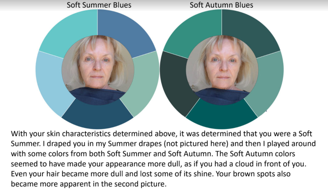
Here is part of the presentation and report on me.
Gabby’s first step is to determine your personal contrast level She then proceeds to determine your hue (temperature), chroma (intensity clear or soft), and value (light or dark). She determined that the above test showed I’m able to wear both warm and cool tones, so I have a cool-neutral undertone.
Gabby decided that this draping shows my complexion has a high content of gray and cool colors blend more harmoniously. The warm colors do not appear to blend or harmonize with my coloring.


Some soft summer colors


Your color journey is so interesting. I will be very interested to hear what you have to say about which you liked best. I have such a hard time with this and would love to have my colors analyzed.
Thanks for sharing.
I like Carol Tuttle’s Dress your Truth, because it addresses personality style, which I think is equally important, along with coloring, and I have gotten so much inspiration from this that I no longer dread shopping, clearing my closet or knowing what is right for me. I combine colors now in different ways, can see my style across the store, don’t need to wear black anymore, and love my look and feel so right with it, including accessories and especially jewelry. It was like coming home to who I really am and how to express that, and taken the guesswork out of fashion choices for me. Now I am truly confidant, because what I wear expresses me!!
I would have guessed soft and cool would work best for you and it is mostly what you wear, but you have Red Leopard coming up, and it seems they will be the wild card. Maybe a blue autumn? They seem to type so many as autumns. I have been tempted by their offerings as I think they did well by “ Une Femme” Susan. I was hoping to visit them in person in London last Spring but of course, that didn’t come to pass. Thanks for sharing all the scoop on the different methods and findings, but I guess it will come down to personal preference at the end as there you are finding little agreement.
I have never had my colors done, but I do pay attention to and remember when people compliment me on an outfit. When someone says, “That color looks great on you,” I am usually wearing soft blues, greens, pinks, or reds. I almost never get a compliment when I wear black, gray, navy, or other neutrals, so I have stopped buying those colors. It makes shopping much easier!
Love how you are searching for your best colors, Jennifer, and I look forward to reading the next installment.
I have the same reaction from people, color yes, neutrals no, I’m a soft/ cool/summer. I wonder if that’s why, I do appear washed out without “color”.
I guess you are having fun with this, but I don’t see these gradations your consultant does. You look pretty much like you in every example.
I have to agree with you. I don’t see much difference either.
I like the blue tones on you the best! I am going to have to figure out how to get back into Pinterest as I have forgotten.
bI enjoyed the first post and I went in and read all about my color type. I was glad to see they had an entire section just dedicated to redheads! I am (was, now helping it along) redhead and although I had a rough ideas what worked well this typing really helped me see that brighter colors are my friend! I have to leave black behind, but I look good in navy so from now on that will take the place of black. When I get my color wheel I’m going to do a brutal review of my closet. I am also doing an evaluation of my body type (from a different blog) and make sure that I finally wear the right color and size!
I am so enjoying your colour journey and hope you can write this off as a business expense 🙂
At least they both typed you as cool.
I found this system confusing as the chroma and value “drapes” contained both warm and cool colours as well as the soft summer blues and greens. And the neutral undertone drape was all warm colours.
What I’m noticing is that there is no consistency in the criteria with all the different systems now, and it may have become more subjective based on the originator. Many of them type celebrities on their sites using media photos, and I’ve seen Meryl Streep typed as an Autumn, Spring and Summer; Sandra Bullock as Autumn and Winter and Kate Middleton as Winter and Summer.
I’m looking forward to seeing the next two, and which one (if any) you feel best with.
Monitors make a big difference too so it’s hard to get an accurate image of colors
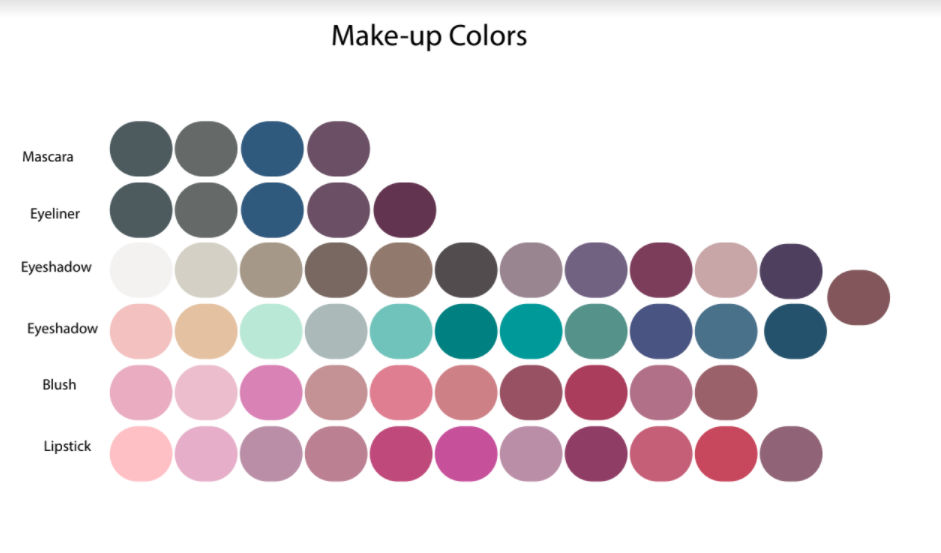
Thank you for sharing the color analysis! I enjoy reading about the different companies. This one includes make up and I’m thrilled with that!!
This is an interesting journey you are on! I’m looking forward to the next two. I think color is somewhat subjective and we see color differently. I have gone paint shopping with my daughter and she sees colors that I do not. It’s all very interesting, like solvng a mystery:)
I think you’re right
Thanks for sharing your experience with color analysis. I’ve only recently discovered that my coloring allows for warm and cool colors. I guess that’s why I can die my dark brown cool toned hair a warm red with warm tones.
I think you look best in soft, muted colors ( like the double denim look). Then again, maybe I just don’t like “Disney Princess” clear, bright colors.
Yep. She was stunning in the double denim look. All blues and pinks look great on her.
Very interesting! Thanks for trying and sharing the 4 methods. It gets us past the “what looks good on me” question with a deeper understanding.
It seems to me that the colors of more expensive garments are more flattering. I once read about the complexities of fabric and dye processes. There’s a reason why royalty wore deep purple. It’s very hard to create!
Funny but I am trying to choose an exterior paint color for my house and keeping these human color systems in mind is actually helpful.
I have similar coloring to yours, Jennifer. I have never had my colors done, but did do the (free) Kettlewell online analysis and came out a soft summer. I love their selection of soft summer colors and feel they would all be flattering on me. I am enjoying your color project and look forward to the next two analyses. I wonder which of them you will finally choose as the best.
Thank you so much for sharing your color exploration journey! This has been an interest of mine ever since the Color Me Beautiful book was published. Can’t wait to see the next two installments!
Enjoying following your journey! Especially nice that makeup color suggestions are provided. Thanks for sharing!
I’m really enjoying your research as well and am looking forward to seeing your process through to the final color decisions. How do you determine if silver or gold colored jewelry is right for you?
That is included with your analysis. I suggest you go with your gut instinct. If you’re neutral you may be able to wear both. I have many pieces that combine yellow and white gold.
I agree with the earlier comment that you are most flattered by the cool colors and light and bright. At least on my phone!
Yes, I am enjoying your research, too. Years ago I had my colors done by (I think) a Color Me Beautiful consultant. There was even a book, too. Now that I am decades older, it would be interesting to see if my colors change. Would it be improper to ask how much each of your “visits” costs?
They do change. Each consultant has her prices listed on their site I link to.
I look forward to these posts on color. Looking at her analysis is interesting. I can see how you do look better in certain photos. I think I am a soft summer. I am anxious to get your opinion on your color analysis. I do think you wear brights better than I do. We both seem to wear and prefer neutrals. I love a good mystery. Thanks Jennifer, this is fun. patval
I’m so glad you’re finding it as fascinating as I am. Next week will shock you.
Interesting, I am a “ summer”, cool, soft, light/ medium. I had my colors done online this year virtually, and my device kept changing my fair skin both yellow and pink, so I’m not sure if I can trust an online consultation, which said I was autumn. I wish someone would write a book about summer coloring, finding clothes in a market that seems more “ winter based” is difficult. Thanks for the article.
I found catching accurate images very difficult too. That’s where the skill of a person becomes very important.
I don’t see this as completely different. Weren’t you cool toned in both? I think the fact you are closer to neutral (though I agree, cool toned for sure), makes you harder to type. But I think you look best in the light brights, just based on what I see on the blog.
There are definitely similarities.
The major difference in bright vs soft. Clear vs muted. Just wait until you see next week!
Very interesting and frustrating indeed. Makes me think I would rather have it done in person. When I went to Metamorphsis in New York 35 years ago, I was shown the makeup colours that worked with my eye and skin tone, and I loved it. Later we were all told to contrast the eye colour with ( in my case with blue eyes) golds and bronze etc. I always felt more alive with the muted blue and pink tones. I guess everyone has their own way of working the colour systems. Personally, I have been digging deeper with Color your Style and find it matches my latest results. I am eager to see how the next two work out as well. I hope you are having fun with this and not too frustrated. There are many good ones out there that suggest the colours in your eyes lips and hair etc are the best to start with. I am enjoying this journey of yours.
Actually meant Your Color Style