Sci-Art Personal Color Analysis
Happy Monday ladies. I’m musing about color today and the myriad ways it affects how we look.
Color Podcast

My color draping last month with the Sci\ART color analyst and trainer, Terry Wildfong, was nothing short of eye-opening. I sat in a neutral gray room, wearing a neutral gray robe and head covering. Everyone in the room wore a neutral gray robe because color reacts to the colors around it. There were multiple full-spectrum lamps for true light and I faced a mirror.
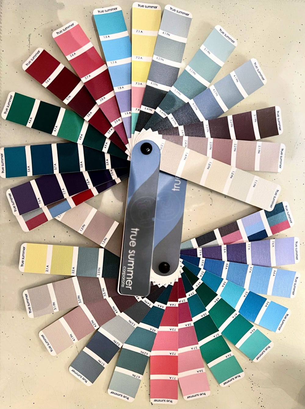
I watched as colors were draped across my shoulders that made my face drain of color or my eyes go glassy. I saw warm colors make my complexion turn sallow. I saw the colors that made it appear I was wearing lipstick and saw what harmonized with me.
Terry explained that, sure, she could make my red blotches fade, but when they did, they came at a price. The fact is, I do have red blotches on my face, and colors that make them fade, also drain other colors from my face and turn the outside of my eyebrows orange. The goal of color analysis is to show you which colors look best on you because they harmonize with you…they should not change you.
You might enjoy my discussion with Christine Scanman and Jourunn Hernes on their color podcast last week. You can listen here. These gals are so talented, I think you’ll enjoy the podcast. I tune in every month.
A Note-
You will continue to see me style many colors that don’t flatter me because I style clothes for you, not me. This is not a diary of what Jennifer wears…although I do share that too 🙂 My blog is a service for you, no matter what season you are or what colors you like to wear.
Thanks for reading, and be sure to wear what makes you feel confident.
Jennifer thank you for talking about WKC, I had not heard of them but will check into to them now.
Yes I use Laura Gellar for several years now and love the line. My favorite is the Quench & Tint, light but can be built up for more coverage. I had my colors done years ago but need to revisit it so thank you for the reminder.
I enjoyed today’s post for numerous reasons, but most importantly – the last line – “hug those you love”. Having lost my husband recently, I know we never hugged enough. I hope your readers will take those words as good advice.
I need to check out the Laura Geller products… you look beautiful! Thanks for the introduction!
Xo
Your description of the setting for doing your colors made me stop and think. The colors tried there either did or did not flatter you, but the world is not a plain grey room with controlled lighting. I don’t know if I would be confident that a particular color would work (or not) out in the real world with bright sunshine, soft candlelight, twilight sunset, florescent doctor’s office overhead lighting, etc.
The purpose of the neutral background (we used soft white when I did Colours back in the 80’s) is so that the client can see how the colour drapes react to the complexion without possibly getting distracted by other colours in the room. The full spectrum lighting is the most natural man made lighting to daylight and provides consistency throughout the consultation. If you used just natural daylight, some days would be cloudy and you wouldn’t see the results as easily. The colours that are best on you in that environment, will be the best in all lighting, even yellow fluorescent lighting. Hair is covered if it has been dyed, and we tried to show as much natural root if possible.
Thanks for explaining the process better than I did. The eye gets distracted so easily without these safeguards.
The point is that it’s a true test of your skin against colors. If they look flattering in a neutral environment they will look good in all environments.
So glad you shared about World Central Kitchen! They do wonderful work & that’s also who I donated to regarding the situation in Ukraine. It’s heartbreaking.