How To Find Your Personal Contrast Level And Why It Matters
Happy Tuesday, ladies. A reader mentioned that she needs to wear different colors within her color pallet since going gray and wondered if there is a formula or guidelines to simplify things. There are three components of a color. Hue is the actual color…red, yellow, blue, etc.). Value is the lightness or darkness of a color. Finally, saturation is the strength, purity, or intensity. Let’s talk about value today, contrast, and how to find your personal contrast level
Our hair color, skin, and eyes all have a value (light to dark) on a sliding scale. Our personal contrast level is the difference between them. Wearing contrast levels that match your own contrast levels is as important as whether the undertone is warm or cool. In some instances, it’s more important!
A high level of contrast is when there’s a big difference between the lightness of one or more colors. For example, if you have very dark hair and light blue eyes, you have a high value contrast. However, if your dark color hair has gone a medium grey, it will lower the difference (contrast) with your eyes.
If you have light silver or blonde hair, fair skin, and pale eyes, you have a low contrast value and will look best in low-contrast outfits. Medium value contrast is when there’s a difference, but it’s not extreme.
Contrast levels that are too strong overpower and wash you out. Conversely, wearing a contrast that is too low reduces your visibility. Knowing and wearing outfits that echo your personal contrast levels keep you looking vibrant and visible at a time when society often overlooks midlife women.
How to find your personal contrast level
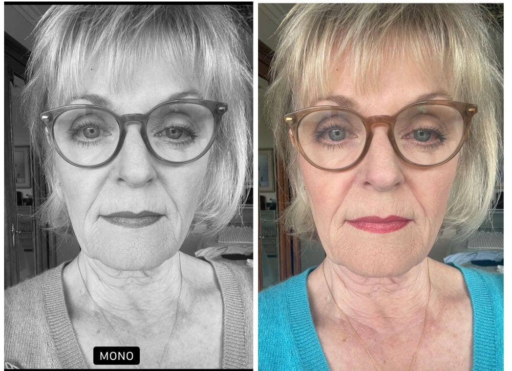
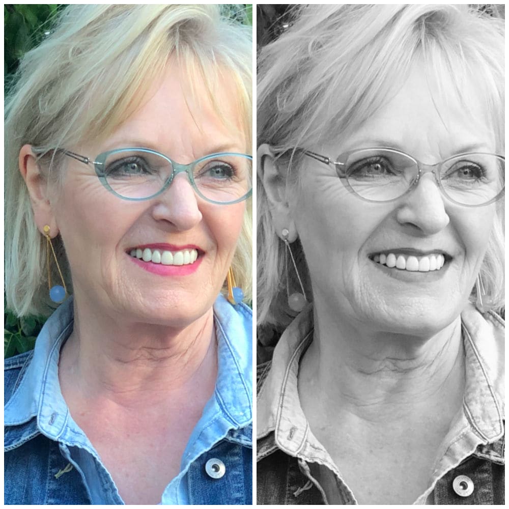
The easiest way to see your inherent color contrast is to take photos of your face and hair. Then use the settings on your phone to change it to a grayscale, monotone image. Now you’ll see the level of difference between the intensity of your hair, eyes, and skin. I have makeup on in my photos, but you can still see the difference.

The black and white have a strong contrast that overpowers me. The red lipstick attempts to make it flattering but falls short in the monochrome image. The black jacket is intense against my complexion. Its contrast with the white shirt draws your eye to the garments, away from my face.
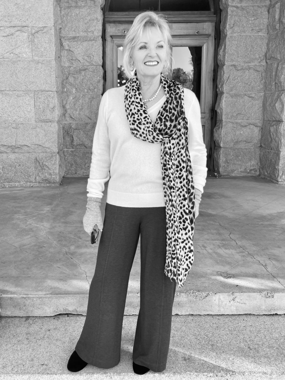
I have light ash blonde hair, fair skin, and medium eyes, so I have low/medium contrast value levels which match the chambray shirt and denim jacket. My eyeglass frames and lipstick are also a low contrast which doesn’t overpower my coloring. What color I wear is less important than how light and dark it is. My low intensity is also why I am flattered by monochromatic outfits because they are the epitome of low contrast.
Let’s look at some outfits. This sweater with different wash jeans is a great example. High contrast is when there’s a big difference between one or more colors. Low contrast is when they’re very similar. Medium contrast is when there’s a difference between them, but it’s not extreme.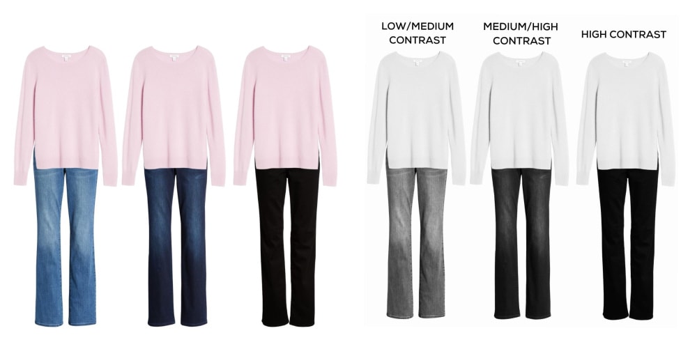
When we remove the color, you can see the contrast levels. The light sweater and deep wash jeans have a high contrast which would flatter someone with equally high contrast. If you have white hair and deep brown eyes, you can wear stronger contrast.
Now let’s try a deeper sweater with the same jeans.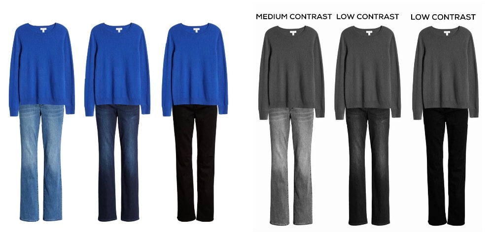
Now here’s a sweater with a medium value and the same jeans.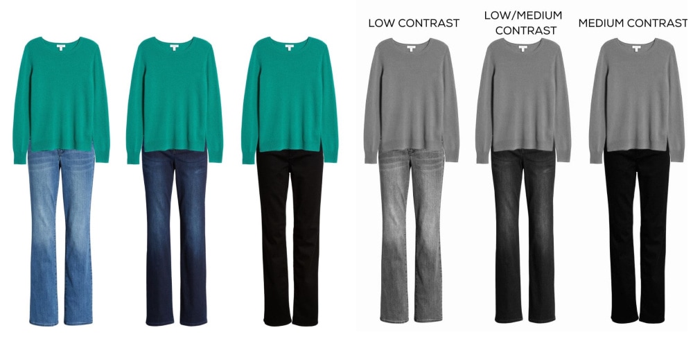
Try this yourself. Do all the grays meld softly, or do your eyes stand out? Is your hair noticeably darker than your skin tone? The comparison is what shows your personal contrast level. With practice, you’ll learn to recognize the contrast levels in outfits so you can wear ones that match your own. These will be the most flattering so you’ll look the most vibrant and visible.
Hair that changes from black to pale gray lessens your personal contrast level, so you will look better in color combinations with lower contrast. You may also look better wearing the lighter colors within your palette. Remember, you will not change seasons, just the colors that flatter you most within those seasons…unless you were mistyped in the first place.
Do you pay attention to contrast levels in your outfits?
Thanks for reading ladies and remember to wear what makes you feel confident.
If you enjoyed this post, please consider pinning it to your Pinterest board, it really helps my business.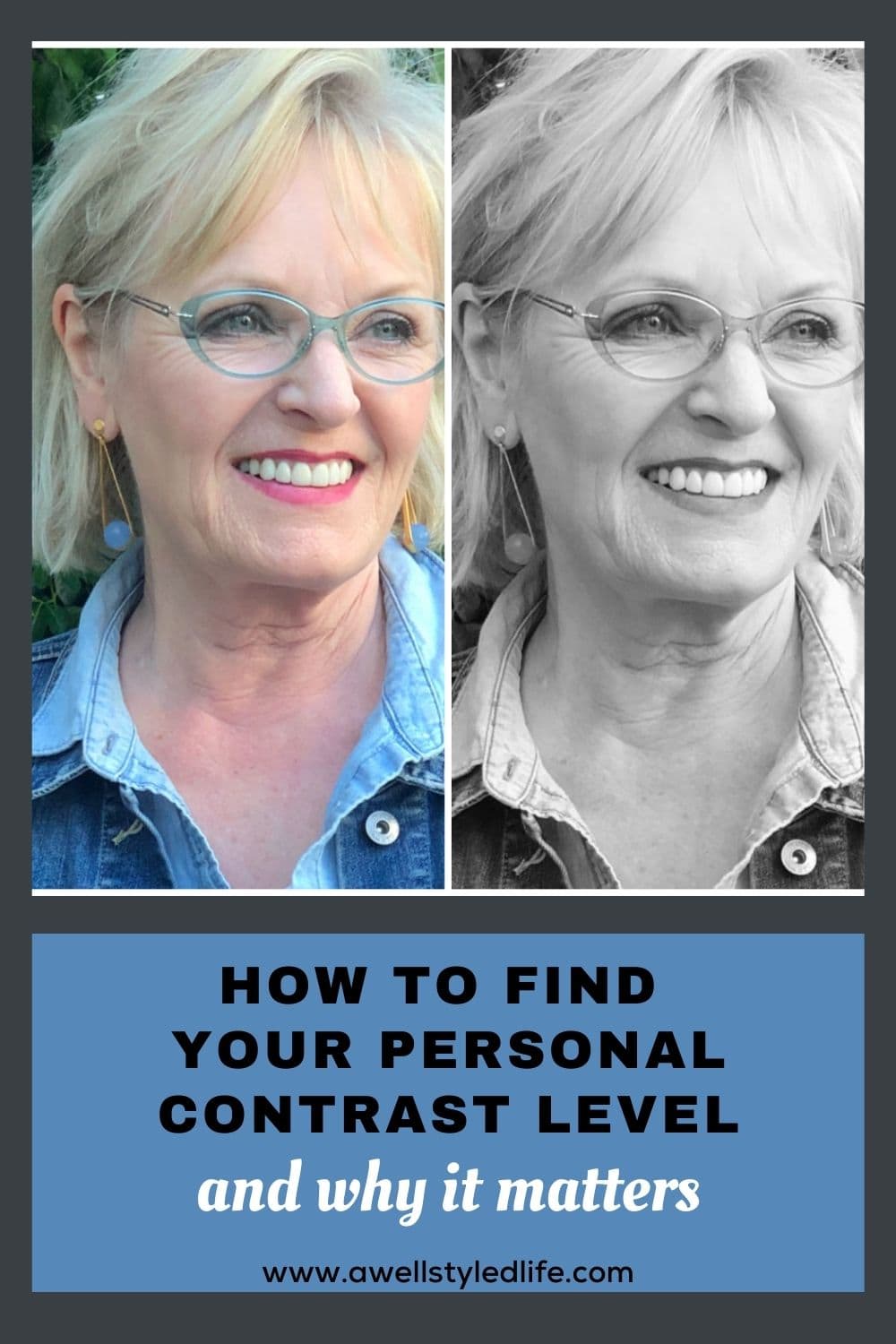
I loved this article, it’s the first time I’ve seen it and will sign up to be on your mailing list. I too have turned silver and wondered why a pale pink suddenly looks good on me, now I know, thank you.
Welcome!
What about nearly white hair, fair skin and very dark intense eyes? When I do the gray scale, my dark eyes take center stage but is that enough to keep contrast higher?
It sure sounds like it. It’s the contrast level and your’s seem high between skin and eyes and hair and eyes.
This was a beneficial article! Thank you for posting it.
I now have bright gray hair with darker tones underneath. (My hair used to be very dark brown.) I have medium/light skin and very dark hazel eyes. I have been draped as a Dark Winter by a professional color analyst. I tried the black-and-white photo you suggested and my eyes really stand out against my skin and hair. Do you think that means I still have high contrast?
It sounds like your contrast is still pretty high because you say “bright” hair and deep eyes but it’s hard to say without seeing you.
Very informative- I was struggling with that. I’ve been analysed online as spring. Quite different to what I used to wear but am finding bright pink with a blue undertone works, as does pale blue and teal. I now have white hair, look permanently tanned and have green eyes with a yellow ring. I’m still a bit hit and miss with new clothing purchases but it’s fun trying things on.
My goodness, this article absolutely made no sense to me. I also couldn’t get past what to do after I changed my self photo to black and white. Now I’m totally frustrated.
You’re looking for the contrast between your features. Wearing outfits with that same contrast level will be most flattering on you.
With strawberry blonde hair getting more gray, brown eyes and medium skin tone, what colors should i wear?
I can’t tell you colors but it sounds like you have medium/low contrast.
As a new reader I’m catching up on what I’ve missed here, and this piece was so incredibly helpful! I had a professional color analysis in 2014 and the part of the lengthy written report I received which made absolutely no sense to me was “contrast.” I understood that Snow White was high contrast and Oprah’s contrast was low (the examples I was given) but had trouble translating what this meant for a low-contrast Autumn like myself. Over the past eight years I have developed a greater understanding through lots of reading, but this just helped those fuzzy concepts click clearly into focus. Thanks so much for a cogent explanation that laypeople can easily understand. Using the monochrome examples makes so much sense! Although I’m in my early 60’s with very little grey hair I worry already about going completely grey, as I remember the color consultant saying “Grey and yellow are colors you should never wear, or have near your face.” I’d love to read more from you regarding how to deal with going grey when it’s not a color that is flattering to us.
Welcome, I’m glad this helped. I’ve written a lot about personal color analysis, which you can find here. I don’t believe that our natural coloring is ever wrong. If you are an autumn, your gray will be a warm gray that works with your face perfectly. The colors you prefer within your palette will shift as you go gray because your skin and eyes will also fade. Some women choose to wear brighter colors to replace the natural color they’re lost. Others prefer to wear the softer colors within their palette.
I hope you will revisit this topic periodically. This insight has helped immensely. I tend to sew most of my woven clothing and was at the fabric store and for the first time help up bolts of fabric in front of myself in a full length mirror. I think I am a low contrast and need moderately soft colors but not “greyed” colors. I seem to have no problem finding the right colors in spring/summer, but when fall arrives, I’m flummoxed! It seems to be a “ high contrast” or “greyed” season for color pallets. Somehow you are able to leap into the deep cranberry reds in your sweater— isn’t that high contrast with your coloring? Am I not thinking straight about this? If I’m low contrast and have light coloring for hair and skin tone, how do I switch to fall color pallets that run deep? Thanks for any help or a future blog post. Loving your blog! Suzanne
PS: Through your “petites” discussions, I’ve learned that, although I’m 5’7” —I gravitate toward petite clothing lines — as though they would fit me! But the designs, colors and styling are totally me! Not sure if I should say thanks for clarifying that for me, or just Help! Lol
I wear a deeper lipstick with the dark cranberry shades. That adds more “artificial” contrast to my own coloring which helps them work. My eyeshadow is probably a bit darker too. Wearing dark cranberry shades with other deep colors, like black, navy, or charcoal is low contrast.
Mind. Blown. This explains a lot!! I keep buying lovely chambray (lighter blues) button downs, white button down shirts, white linen button down shirts, so classic, I love them but when I put them on I HATE THEM ON ME. I can’t tell you how many I have purchased hang in the closet unworn. I have dark brown hair, medium blue/gray eyes and light/medium skin w/yellow undertones. I love how I look in BLACK. 🙂 I look awful in yellows, pinks (so hate pink but love it on other people) tho I love white but can’t hardly wear it. Maybe a vivid white? Cannot wear ivory to save my life. Blech. I’ve felt so limited in the colors that I feel good/look good in. I love all one tone outfits on others, neutrals and yet when I try it, it’s awful on me. Would you say I’m a high contrast and I need that contrast next to my face? Oh, so maybe a contrasting scarf or shirt under the chambray or white shirt?
I certainly can’t say for sure, but you sound like a cool-toned, medium contrast. You likely need colors with more saturation/color in them. A scarf at the neck is a great way to make unflattering clothes work with your coloring.
Wow!! I can see a huge difference in contrast. I never thought about that. Makes sense. Thank you
I can’t believe how much we are alike!! For example: 1)our hair texture, etc. sounds exactly alike. It’s the same length as yours right now. I’m attempting to let it go with its natural color. I have Parkinson’s Disease, therefore it is getting difficult for me to style so I’m experimenting with hair styles. 2)like you, people often comment that I am “so dressed up” while I don’t think I am. It’s just me. I feel more comfortable with “a little bling” or a simple accessory. I really wanted to wear a flannel shirt so I purchased one….not for me!! As I went out the door, I felt like I had left my axe behind!! I love to see the look on other women! I thoroughly enjoy your blog. I feel like you are talking directly to me!! Have a great 2022!!
Happy 2022, Sandra! My flannel shirt did not get worn very much before I donated it:)
I tried this exercise. My hair is salt and pepper/ medium eyes/medium skin with warm undertones. I feel like I look best in dark medium contrast. Colors need to be saturated. Is that because I have two medium and 1 light feature?
Saturation is another component of color so the three work together. Saturation involves how vivid or muted a color is. That’s different than hue (light or dark) which you use to determine your contrast level.
Thank you for this explanation of contrast and also far the color analysis. I know it plays a role in the things we wear but I have often had a problem with color analysis. Contrast makes a lot more sense.
This is so helpful to me Jennifer as I have forgotten how to dress myself and feel confident. Thank you!
I’m so glad this helps.
An excellent article! I always knew that sometimes there was something not quite right, and now I know it is all down to contrast. Thank you so much.
Great post with very helpful tips and examples; thank you! I recently discovered that with coloring similar to yours, I am on the low side of the contrast scale. No wonder those bold black and white combinations never really worked for me!
Ditto for me:)