Virtual Color Analysis With Joan Kosmachuk
Happy Thursday ladies. Today is part four of my series on virtual personal color analysis. I will share my thoughts in a wrap-up post next week because I want you to see what I was presented and decide for yourself. This week it’s my Suzanne Caygill method virtual color analysis with Joan Kosmachuk.
- My journey began with an Online Personal Color Analysis With Your Color Style who typed me as Bright, Cool, and Light.
- My second experience was a Virtual Color Analysis With Dress Your Colors who typed me as a Soft Summer.
- Last week I shared the results of my Online Personal Color Analysis With Red Leopard who typed me as a Soft Autumn.
Joan trained and mentored in the Suzanne Caygill method of Seasonal Color Analysis who’s underlying theory is that our hair, skin, and eyes create a beautiful inherent color harmony. This intersects with our energy, personality, facial structure, and other physical characteristics. All these factors are taken into account to determine your most flattering colors.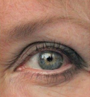
This analysis worked slightly differently. I sent Joan two photos. One of my bare face in bright light with my hair covered and one close-up of my eye. We spoke on the zoom for about an hour so she could see me, ask questions, and get a feel for my energy/personality. Several weeks later we did a zoom call to discuss her conclusions.

Here is some of what Joan sent me-
“You are dominantly cool and neutral with a little warmth. You are low-medium contrast. Your colors are middle value, clear or milky. Your classic (and casual) style has an elevated simplicity, with a touch of lighthearted piquancy.” – Joan
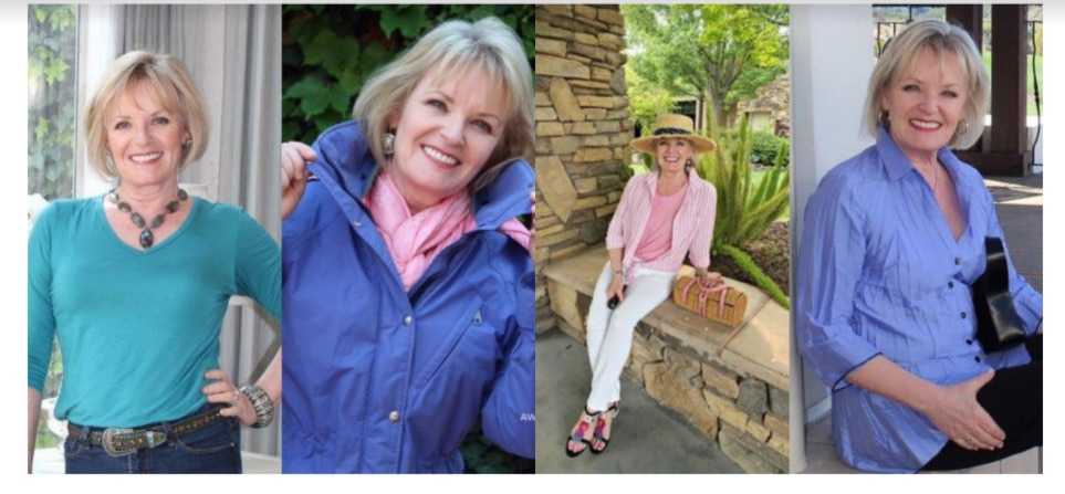

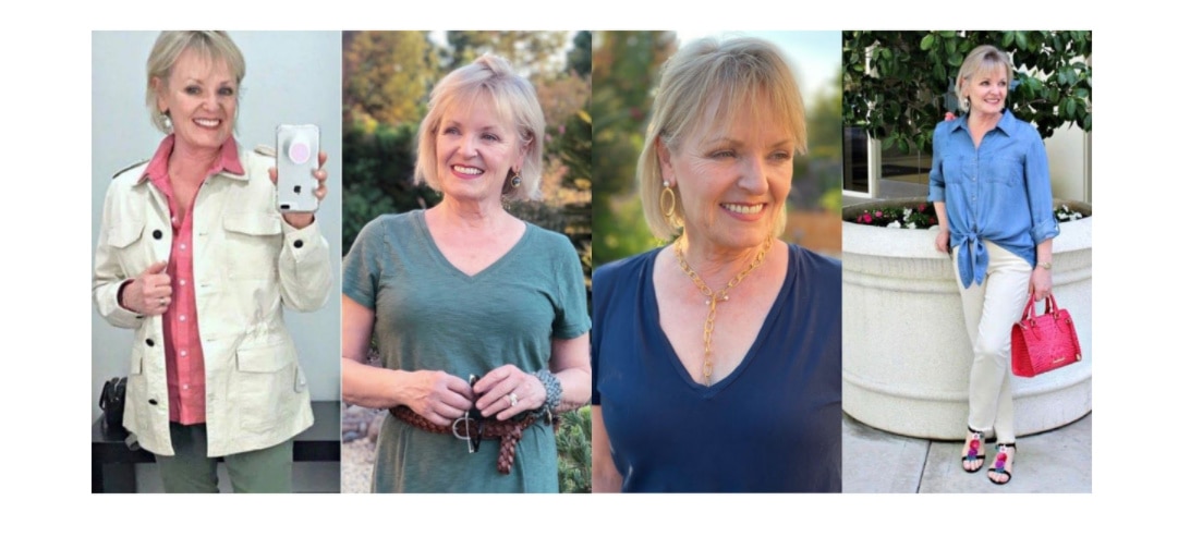
Bingo! The three rows of pictures really helps me “see” the results better. The top row of pics is gorgeous on you! You come alive! The second row looks too heavy, and dark on you, the third row looks more washed out, compared to the first row. The pics side by side tell a better story. I agree, this one seems right on. Great job!
It seems as though all comments are in agreement..this one is the best. I love the color pallet. It is fresh and very complimentary to your coloring. By far the best one.
This color analysis couldn’t have been more clear about which colors best compliment you. It seems that your basic instincts were to reach for these colors over and over. As much as I might love all the bright, clear colors, they are getting harder to wear. It’s that sharp contrast that they create. I am softening the contrast with hair color, hair style, makeup and clothing choices.
This was a very interesting study but also a bit alarming to see the results of these four analysts land all over the place. Maybe now you could contrast your denim or chambray shirt with a cool, bright tank or scarf.
Definitely the best! Those colours are very flattering, enhancing your natural beauty. As my coloring is similar, and those colours suit me, I plan to nowl cull anything less suitable from my wardrobe. A colour consultant told me 30+ years ago that I was a Summer . Sophisticated Spring sounds just right.
I like you better in the dark re and the cobaul photos better
I have been following this and I totally agree this one is the best analysis so far. I’m also a visual person so I was amazed that your colors she selected were perfect. Loved the color fan too.
Definitely spot on! I like the comment that she can ‘see’ you first. I never looked at it that way. She was right. The pictures in which we see you first are the best!
IMO – this is the best one. I love the whole color typing science and feel she got it right for you. Luckily, you were probably easier than most clients because you have so many photos of yourself in so many different colors to help type you.
Wow! I think she nailed it! I like this analysis best!
I love these colors on you! Best one
I do think that this one is a very accurate analysis of you as a whole. I am so glad you chose her for one of your four, as she trained with John Kitchener and that is the one I have the most faith in myself. Isn’t it interesting how the very bright colours can enter the room before you. It took me a while to figure out why people would say how much they liked the colour or item instead of noticing me. This must be a very frustrating journey for you, and I am eager to hear next week what your true feelings are. Thank you for taking us along on your adventure. I am sure I can speak for many, I have learned alot as well. You look lovely in the colours chosen.
This is really the best group……brings out your eyes and makes your skin glow. You look much younger and brighter. Especially the first group……….enjoyed the process.
Wow! The colors she recommended look amazing on you! I have watched this closely as we have almost identical coloring. I think this is the best of the four. She was spot on!
Best one yet IMO! It is transforming once you see yourself in the correct colors (I’m a visual person). This seems spot on! Can’t wait to hear you weigh in on all 4.
Best of the four, IMO. The contrast of the more vivid colors to the milkier ones was spot on!
This one seems to fit better than the other three. It was interesting that she focused on the eye shape and color.
I love you in the top row of colors- Aqua, periwinkle blue, pink! I think we are the same coloring…waiting for my results from Your color style. Where did the aqua v neck tee come from? Love your posts!
I think she nailed you!! Definitely the best one of the four!
This one definitely seems to be ‘you’ and the examples shown back up the analysis really well
Best one !