Virtual Color Analysis With Joan Kosmachuk
Happy Thursday ladies. Today is part four of my series on virtual personal color analysis. I will share my thoughts in a wrap-up post next week because I want you to see what I was presented and decide for yourself. This week it’s my Suzanne Caygill method virtual color analysis with Joan Kosmachuk.
- My journey began with an Online Personal Color Analysis With Your Color Style who typed me as Bright, Cool, and Light.
- My second experience was a Virtual Color Analysis With Dress Your Colors who typed me as a Soft Summer.
- Last week I shared the results of my Online Personal Color Analysis With Red Leopard who typed me as a Soft Autumn.
Joan trained and mentored in the Suzanne Caygill method of Seasonal Color Analysis who’s underlying theory is that our hair, skin, and eyes create a beautiful inherent color harmony. This intersects with our energy, personality, facial structure, and other physical characteristics. All these factors are taken into account to determine your most flattering colors.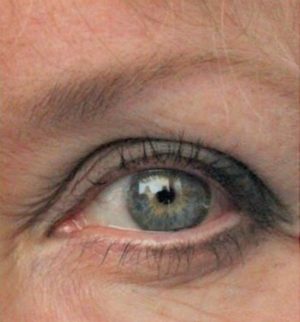
This analysis worked slightly differently. I sent Joan two photos. One of my bare face in bright light with my hair covered and one close-up of my eye. We spoke on the zoom for about an hour so she could see me, ask questions, and get a feel for my energy/personality. Several weeks later we did a zoom call to discuss her conclusions.

Here is some of what Joan sent me-
“You are dominantly cool and neutral with a little warmth. You are low-medium contrast. Your colors are middle value, clear or milky. Your classic (and casual) style has an elevated simplicity, with a touch of lighthearted piquancy.” – Joan

I agree that this is the best one, but the colors given to you really seem more Summer colors than Spring colors. I was also struck that the colors you were given are pre-dominantly Blue and Blue-green with just a smattering of Pink and Grey. It is more limited than most color palettes I have seen. I am eager to read what you have to say on the different color palettes.
Amazingly spot on!
My sister, I and my mom had our colors done 45 years ago. Yes that’s right. Our consultant was spot on and I have used her analysis ever since when purchasing items for my wardrobe. This has actually stretched my wardrobe to twice the combinations I can wear.
Your last analysis was spot on. As we age our skin gets thin and shallow so the colors she picked for your are true compliments to your undertones.
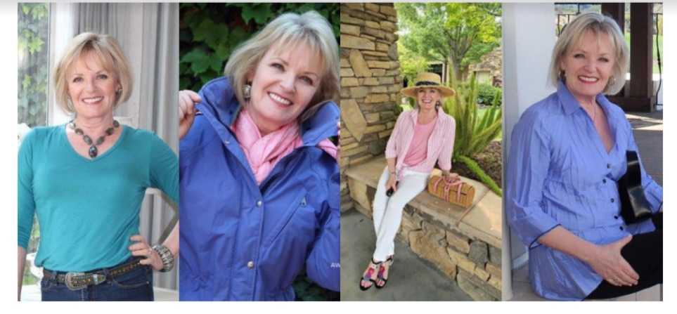
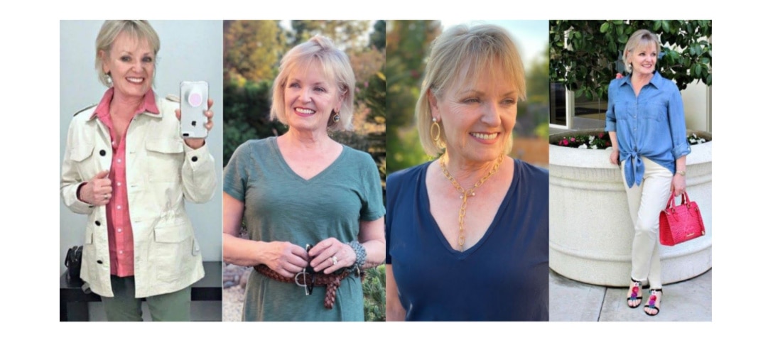
This one really is very clear, that first row of pictures YOU really shine! Can’t wait to follow your journey as you transform your closet!
I’m with the crowd! DITTO DITTO DITTO. First time I have ever considered a color analysis.
I agree with the others, this was the best analysis yet. And probably the closest to an in person consultation, as she took the time and effort to go through all your photos to show examples. It also feels more personalized than the others.
I just wish she hadn’t called this pallet “spring” as in my mind I think of the traditional warm, spring colours, which this is not. But, that’s just me.
And yes, you shine in the colours in the first row of examples.
“Pictures are worth a thousand words” The series of pictures make it so obvious. Time to clear out your closet of all the clothes that are hiding you and focus on bright, clear colours that highlight your beauty.
She’s right on the money!
I love these colors on you.
The explanations of color value are good. Now I see why although I buy strong, clear colored sweaters, I end up not wearing them. And when I wear too pale colors, they wash me out, making me unnoticeable.
These are great photos to show me the difference. I’m looking forward to reading all about your final decisions!
I agree with everyone that she really nailed it. Those colors really do show your energy! Looking forward to the next installment.
Clearly, this colour analysis is the right one. No question. In the photos of you with your proper colours, my eye goes right to your face, your eyes, your smile. In the photos of you in the inappropriate colours, my eye goes to the clothing. How smart you are to try several colour analyses until you found the right one.
Didn’t comment on the other analysis as was waiting for the finale. With that said; I too feel this one nailed it!
Joan did it…! Best all over.
I agree this one seems to be the best. I like how she looked at your energy level as well as your skin tone. I look forward to your analysis. I too am a soft summer I feel like I can wear muted well, but sometimes I feel like the muted colors do not connect with my energy. I will say there are times I love wearing muted just not all the time. hmm… patval
Thank you so much for going through this process and sharing the results. Quite helpful to those of us who are considering a color analysis. Some analysts are big on hyping themselves in social media, so it’s hard to tell whose results would be more accurate. Love your look this time and the comments from Joan.
I agree with all the others. Those three lines of photos tell the story! I was struck by how much you glow in those first pictures. She was exactly right – YOU are what comes through, and the colors highlight YOU – not the other way around.
This recent analysis nailed it! Sophisticated Spring! I can see that your eye color has a some yellow around the iris, which leads one to a warm conclusion. Yet your skin tone is neutral.
However, to push that further into what type of spring is certainly on a higher level than the other analyses. I like your personally tailored color fan too. My favorite so far! I look forward to your conclusions. Are you going to give up on your black? (Black is slowly but surely leaving my closet. Navy too.) Thanks for the ride!
We have the same skin, eye and hair color and I agree with most of the comments today that this lady was spot on with your colors! Jewel tones are our friends.
Yes, I think this one is the BEST. The Spring brings forth your beauty. Now maybe that is because I love those colours too. My eyes are an exact match for yours.
The question for me is how do you bring this colouring into Fall and Winter seasons as we head there?
Good morning Jennifer! Up till this point I didn’t think color analysis was worth your money because I didn’t feel any of them were doing you justice. But these colors are exactly the ones for you. It brings out your true God given beauty and even your personality. I feel in these pics you are wearing the clothes and the clothes aren’t wearing you, if that makes sense. Great job on this one!